Thursday 20 December 2012

final design


My initial t-shirt design ideas


These are my six t-shirt designs, all my work has been leading up to this final piece. My final t-shirt design. Thinking long and hard about different designs i went for these six. They are all surf related designs so it completes the brief.
For each design i had to use a different method and technique. 
For  my first design i used a finer liner and water colours.
for my first design i was planning on scanning it on Photoshop and adding colours or changing the hue saturation on Photoshop of the water colours. To give it a different effect. 
For my second design with it all the blue t-shirt design. I went for a more simple but effective design, just a simple silhouette
of a man, surfboard and a palm tree. This design would be edited in Photoshop to add a watery effect to the blue at the bottom of the t-shirt. 
For my four other designs i draw them with a finer liner and planed to scanned them into Photoshop and add colour. I couldn't really use these designs because two for them i copied for the internet and other were to big for an A4 sheet. Which was the size of the paper we would be printing on.

So i came up with a different design which would meet the criteria, fit A4 paper and be eye catching. 
   

This is the design i came up with it sticks to the criteria and is also bright and  interesting, i needed to add some think more to make my final piece more interesting then just a plan background. so i thought back from all the different techniques i used over this project and remembered my background i used for my other design. With was surfing related works and colour to give it texture and add something interesting.
I really like my final design because it's refreshing, colourful and meets the criteria of being a surf related top.
If i was to sell my design in a surfing shop, I would sell one top for £12.99 it's not to cheap that i wouldn't make a profit but not to expensive that people wouldn't buy it.
This design is aimed at the younger market for 10-19 year old's.


this is the background i used in my other design .


Monday 19 November 2012

Written comparison and evaluation

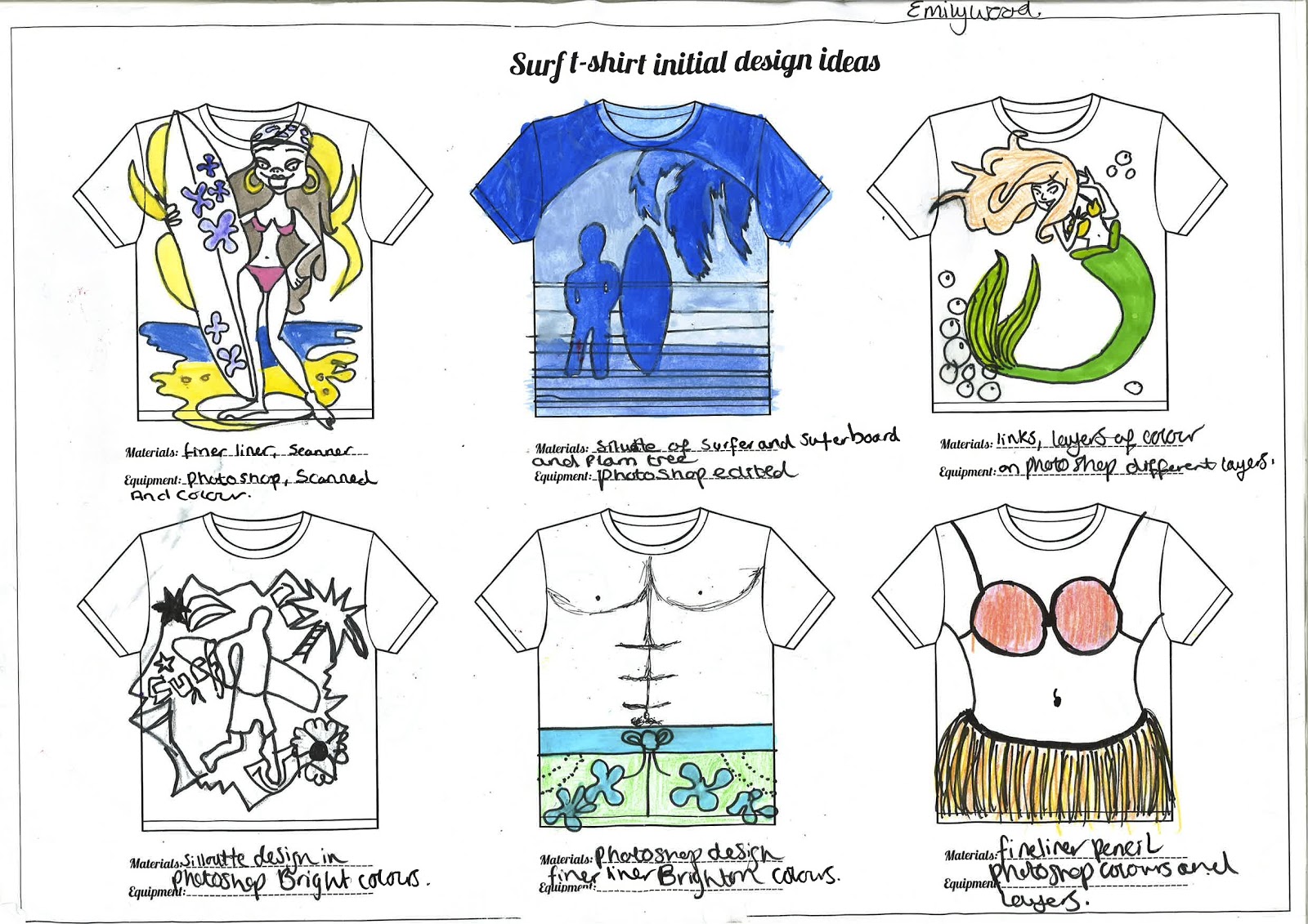
Comparison and Evaluation 


This is my own version of  Si scott's typography

I followed the tutorial in lesson and found it quit hard to understand and follow but i tried my best. 
we had to complete two typography one in black and white and the other in colour.
As i already said i didn't really understand the tutorial and found it quit complex.
The tools on photoshop was hard to use and i have to change the settings a lot to try and make it work. It was along process to do and in the end i don't think my final results are that great. 
I don't think it looks any thing like Si Scott work, He's work is full and busy and mine is empty and bare. He's work has multiple of different yellows and oranges and mine is just  one plain colour. 
He's work had  multiples of different flicks, twists and curls and because i found it hard to do in photoshop i hardly have any. 

After i done my photoshop typography i created a hand drawn for my final example.
For this hand drawn typography i used a ruler, pencil and fine liner.
I  had draw a "totally awesome" typography.  I prefer my hand drawn one to my photoshop. Just because it different from Si Scott and my photoshop one too. I think it has more detail even though it doesn't have any colour. 
I prefer the curls and twisted in my hand drawn, i feel that it has more detail and is more my own style.
I think my final hand drawn example is good but i can do much better.So i took some time and added colour. 

By adding colour is has enhance my final outcome completely
it has given it depth and texture. By using water colour penicals 
and water it has created this water feel great for my surfing project.
Also adding twist and curls and curves it also stick to the themes project surfing.
I thought about using different colours but i stick with blues and greens because i feel that symbolises the sea.
I now really like my final drawn typography.
I dont' prefer si scott's work to Oscar Wilson's, i found Oscar's more colourfully.  


Oscar wilson 
A callagram artist making known objects out of just words.
I started my t-shirt design by sketching a silhouette of two people holding a surfboard, I then added in words to fit inside the image words that linked to my surf project, then rubbed out the outline i scanned my callagram into photoshop rubbed out unwanted lines, colours and areas in each word.

I think the difference between oscar wilson's work and mine is that this work is much more organised and neat also the way words take the shape of the image exactly. Where mine isn't as organised as his although you can still see my image, some of my words are different sizes to others.

My use of colour is different also because he uses exact colours that link to the image for example if he made a callagram of a post box, he would make all the words red. As for my callagram it's brightly coloured and has no relation to my surfing brief. Most people used dark blues and light bluely, greens. Were i went for a range of colours,personally i like my colours of my callagram. It makes the image look fresh and clear.

Oscar wilson makes his callagrams look realistic and have depth and from just varying the size of his words in his callagrams which i just slightly managed to do with mine.

The words he uses in his callagram isn't just random words that have no meaning to his work. They link in with the image. I also applied this to my work so i used surf related words like sand,beach,sea,dude,surf,awesome,wet,and waves ect.

I find Oscar wilson's work fascinating because the way he manages to just use words to make such a strange manfully image.

The part i found most hardest when, was trying to do an Oscar wilson inspired piece was trying to make my image actually look like what i wanted it to look liked. It was very hard to fit the writing in to my shape. And to make it aesthetically pleasing.
Although it was hard to do i found the task quit pleasing and enjoyed it very much. Know i how to do an inspired callagram like oscar wilson's i will be doing it more in my work.


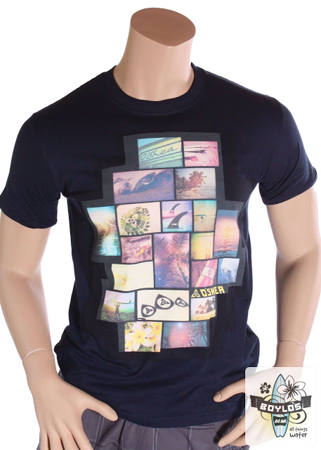
 Linn Osbourne is an artist who creates photo-collages.

First i had to follow the tutorial,to create my photo collage. Using the photographs from Brighton. 
If we didn't have an photos from brighton we could use 'Found' images from the internet as a staring point.
 My for my first design i used 'Found' images from the internet just googling surfing photography and surfing Brighton. I liked that design but it's a bit plan. I could of used more images for the t-shirt and maybe could have more text with a different font. I also could of used a different colour t-shrit or different colour text. I think this design would look better on a white t-shirt the colours would look harmonious.   


This is my 2nd design I prefer this design to my 1st one 
i think the colours are harmonious, i like how i have used all my own BRIGHTON photos. And i have placed my logo at the bottom of the t-shirt.
and also the Jw at the bottom of the top for Junky waves.
I like the fact i have also put on my design name junky waves in a big font in white and also put brighton on it too. 
I used a black and white effect for my photos, i think this is a good effect for my t-shirt. The comparison to Linn is that we have both used photo collage and have used images that is related to our work. As she has gone for colour and i followed the brief of surfing. Linn's colour was all about colour but i thought i would mix it up and use black and white effects for my photos and by doing this it has given it depth. I really prefer my t-shrit design photos in black and white. 


Out of the three design i have tried i really prefer Linn Osbourne and oscar Wilson's. I prefer them because they are bright, bold and colourful. I like how you can use their techniques for anything and everything. Unlike Si Scott's which you have to do written design and use curls and twists.
I think a Linn Osbourne and Oscar Wilson's inspired design would look better on a surfing t-shirt.

Wednesday 14 November 2012

photo stencil and Chris Ede Illustration

Photo stencil illustration.


my stencil design 
I used my brighton images from our trip to create this effect.
This is a design i might use for my t-shirt and brighton links into surfing.
this is a simple 2 coloured stencil using photoshop.
black and purple stencil and a white background.
it was quit easy to do following the video, You had to create  layers for this design. using layers made this effect easy because you layer the same photo on top of each other and add colour so for example purple. After you delete the background so it's blank. Then you can another layer and fill it with another colour for example black, so you get a really good effect.


This is what it looks like on my t-shirt, i think it looks really good. I might add more purple to the sky and the top part of the design is quit plan. Or change the colour of the t-shirt to black.
I followed the second tutorial to use more advanced techniques on photoshop for this illustration.It helped me create illustration like Chris Ede's. I used images from the internet for this tutorial.
I used a surfing girl silhouette and a greenly/bluely background.


Friday 9 November 2012

Linn Osbourne


 Linn Osbourne is an artist who creates photo-collages,
a bit like those used on the t-shirts above.

First i had to follow the tutorial below to create your photo collage. Using the photographs from Brighton. 
If we didn't have an photos from brighton we could use 'Found' images from the internet as a staring point. Or enhance your image if necessary.


 This is my first t-shirt design, for this design i used 'Found' images from the internet just googling surfing photogrpahy and surfing Brighton. I like this design but it's a bit plan. I could of used more images for the t-shirt and maybe could have more text with a different font. I also could of used a different colour t-shrit or different colour text. I think this design would look better on a white t-shirt the colours would look harmonious.   


This is my 2nd design I prefer this design to my 1st one 
i think the colours are harmonious, i like how i have used all my own BRIGHTON photos. And i have placed my logo at the bottom on the t-shirt.
and also the Jw at the bottom of the top for Junky waves.
I like the fact i have also put on my design name junky waves in a big font in white and also put brighton on it too. 
I used a black and white effect for my photos, i think this is a good effect for my t-shirt and makes it looks good.


Monday 22 October 2012

OSCAR WILSON INSPIRED CALLIGRAM

                      Surfing Calligram                       


inspired my oscar wilson i made a calligram design to print on to my t-shirt. Oscar wilson uses bold text to create he's figures.


Using words that connect to he's work.

So just like Oscar wilson i made a surfing related design with surfing related words for my t-shirt design.
Using words use as water,sand,wipe out, awesome,dude, cool bro, tide and many more.
After i had drawn my idea on paper i scanned it in to photoshop and added colour. I used bright colours so the words would be more catching on a white t-shirt. I really like my calligram design of the two surfing dudes and their surf boards. 


SURFING SILHOUETTES

 SURFING SILHOUETTES

Silhouettes design was a long process, first you had to draw up a design that you wanted on your t-shirt. Then you had scan your drawing in to photoshop and create layers and a background. Then you had to add a photo from our trip to brighton and write surfing related text all over the background. Then by adding colour and fading the text and photo, It created a unique effect. I chose oranges and yellows for my colours as they reminded me of a warm sunny day and also of the sun.


After you added the colour to your design you then had to add a block colour for your background. I tried my design with both black and white and decided that i liked the white background for my t-shirt design more as it went well with the t-shirt.


Monday 15 October 2012

Double Exposure


    What did you do? Relate to the examples you’ve seen (are there any similarities?)
    How did you do it? Explain technique and stages
    What went well? Are you happy with it? Did you enjoy making it?
    What could you improve? …if you had more time, use of composition, space, etc.


Monday 8 October 2012

Vasilisa Forbes


Vasilisa Forbes inspired work


The before shot.


 My inspired work from Vasilia Forbes, i used an old vintage photo taken in brighton. just like Vesilisa i chose this photo and  to cover the faces because our project is all about journey's and to me a trip to brigthon was a holiday "journey" in the old days. This is a found image " 2nd hand" this is was vesilisa does with her work too. I chose to cover the face because i don't want anyone esle thing it's an old forgotten memory i what people to feel that it is everyone's memory to share. I revived this picture by adding colour which brings it back to life. The reason why i chose this colours was to mix it up abit, you always socalise blue and green which boys and because i wanted to changed the way people look at this pciture i swopped the colours around with the gender of the chlidern to give it a different meaning and depth. that everything isn't  always what it seems.  


1.


This picture is more about trying to see what colours would make different colours but over lapping them. I also just wanted to try out different sizes rectangle and rotations, i also want to see how good or bad the over lapping effect would look. i also tried the fading tool so see how transparent the shapes would go. And i think it worked quit well.
I also wanted to cover the body's in shapes and just leave their feet, sticking with the subject matter "journey's" i only wanted people to concentrate more on the feet because feet= walking=moving=traveling=journey's.  And if you can't really see their faces and only see their feet i want people to relate to that and think about their own journey's and putting themself in their shoes as if they was experiencing right there.


2.


Si Scott comparison to my own work

Si Scott Comparison to my own typography


This is Si scott typography, In class we did a comparison to he's work because if you look at he's work you can see the detail have curls and twists e.c.t. because our own project is about surfing the curls and twists symbolist waves.
so in lesson we followed a tutorial to creating our own typography.

 These are my own typography 
i followed the tutorial in lesson and found it quit hard to understand and follow but i tried my best. 
we had to complete two typography one in black and white and the other in colour.
As i already said i didn't really understand the tutorial and found it quit complex.
The tools on photoshop was hard to use and i have to change the settings a lot to try and make it work. It was along process to do and in the end i don't think my final results are that great. 
I don't think it looks any thing like Si Scott work, He's work is full and busy and mine is empty and bare. He's work has multiple of different yellows and oranges and mine is just  one plain colour. 
He's work and  multiples of different flicks, twists and curls and because i found it hard to do in photoshop i hardly have any. 


After i done my photoshop typography i created a hand drawn for my final example.
For this hand drawn typography i used a ruler, pencil and fine liner.
I  had draw a "totally awesome" typography.  I prefer my hand drawn one to my photoshop. Just because it different from Si Scott and my photoshop one too. I think it has more detail even though it doesn't have any colour. 
I prefer the curls and twisted in my hand drawn, i feel that it has more detail and is more my own style.
I think my final hand drawn example is good but i can do much better.So i took some time and added colour. 


By adding colour is has enhance my final outcome completely
it has given it depth and texture. By using water colour penicals
and water it has created this water feel great for my surfing project.
Also adding twist and curls and curves it also stick to the themes project surfing.
I thought about using different colours but i stick with blues and greens because i feel that symblises the sea.
I now really like my final drawn typography and i really think it sticks to the theme of my project and Si Scott has definitely inspired my work.


Wednesday 3 October 2012


Review on my final logo
  • Are you happy with your final logo? What works well?
I'm very happy with my final logo, i think what works the best is the use of colours and how the tales 
Represent  j and w for my logo name which is Junky Waves.
  .Do you think you could do anything to improve on this? You must write at least one comment here but more would be good!

There would be a few things i would liked to change about my final logo, i don't  like the eyes on my mermaids at all i think it looks silly and i would change them so they look  realistic and add colour to them. Also i would change the effects on the tales on my 2nd logo i found a good tool to use in photoshop which was a bit like spray paint and with this effect i was able to create a realistic scales for the tales. Another thing i would like to change in my logo is to ADD a background! i forgot to create one and on a whole i think it would look must better if i added sea,sand and maybe a bit of seaweed.
  • Was there any logo that inspired your design?
There wasn't an logo that really inspired me that much. I googled a lot of "mermaid logos" and the only famous one i found was Starbucks. The mermaid in this logo has also two tales and gave me my idea for my different letters.  My real inspired was from my mind map and my quick icon drawings  so went with one of my icon drawings and carried it on from there.


digital experiments VS handmade experiment

digital experiments VS handmade experiment 


handmade experiment 


investigating photographic techniques
this experiment is in the style of Julie Cockburn, by finding an vintage photo and using tissue paper of 3 different colours it blended the colours together. this is a really cool technique, it gives the experiment an edge and a tone.


investigate photographic media, techniques and technology
 use photographic media, techniques and technology safely
  to use the shape tool, clipping masks, opacity and layers in Adobe Photoshop.i really liked this effect  more then the tissue paper i like the colours i used and how they all blend it.

                                           Digital Experiments


Surf project

The Surf Project!


On our first day we had to match the logos to the logo types
there was 6 different ones to find out 1. Combination mark 2.Brandmark symbol 3.Letter mark 4.Emblem 5. Word mark and  6.Abstract this was an see what logo type we knew of.


After doing the logo types we draw logo icons, a quick 30 seconds sketch of different subjects e.g fish, seagulls, waves.

This is my surf project mind map.
This is full of useful information and ideas when was thinking about bands, logo names, target audience   , surf related works and existing surf brands. i filled the page with little quick drawing to get my idea flowing . My mind map really helped out with picking my final logo name.


This is my sheet of notes on What makes a good logo,
this was more of a question and answer session
i thought of all the different things that makes a good logo and wrote it all down and at the end of the session the class all talked out it and i added anymore notes that i didn't alright have.


Logo drawings
Here are my first 4 logo drawings i thought of Junky waves as my logo name so i tried to incorporate j,w into my work. we also had to try out different types of logo styles for example: letter mark, Combination mark ,Brand mark symbol,Emblem,Word mark and Abstract. 
Here is the another pages of my logo drawings.


                                                                   Calligrams  
                          

This is my calligrams that we used to try and an technique in photo shop in one of our lessons.
we was quite simple to do after following the video. by adding colour i think this is an effective logo and was considering using this an my final design. 


My final design   


 After putting a lot of thought in to it i decide to choose my mermaid design,  i followed my viedo 
i adding colour and a pattern to one of the tales. I really like this out come and thought it looked pretty good  My logo also has a hidden message to. Because the tales joins up togother it creates and W and the mermaid with the red hair stands for a J so that  Junky Waves. 


 This is an extra one i did in my free time. i used a different effect this time with the spray paint tool.
i really like this design too but it doesn't look as neat and my first one, if i had to choose i would choose my first final design.